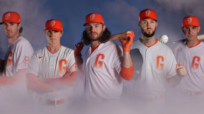
Today’s assignment: A deep dive into why, exactly, everyone is so upset about these Giants City Connect uniforms.
There must be some Freudian reason, the reactions are so intense. Or Jungian; maybe something about the duality of Barry Bonds? Or something so deep-rooted, only Lucy from “Peanuts” could explain? Five cents, please, to sort out my primal feelings about the Giants in foggy orange.
I confess, I did not want to clobber the uniforms the first time I saw them. One thing about our show is, Paulie Mac and I never cook up our takes for maximum conflict or agreement. We just live and react as we see the world. Frequently, that means not taking the world too seriously — unless we’re talking about The Wave. Or 7-inning games. Or the DH. Or runners on second in extra innings.
(Better get back on track before I get too worked up about those things.)
When I saw the Creamsicle Nike efforts, though, I cautioned myself to give the things a chance before I knee-jerk blasted them and then went on a rant about how everything would be better if Will Clark was still wearing black turtlenecks and Roger (Humm Baby) Craig was calling for suicide squeezes.
I thought to myself: Self, maybe you are not the target audience for these very orange things. Self, try to see these things through the eyes of your kids, who don’t really want to hear your ancient stories about Mike Ivie’s grand slam off Don Sutton.
A good friend worked for the Oregon athletic department when the Ducks started going nuclear Neo-green and Neo-lime and Neo-lemon with their colors. This was 20 years ago. When I told him how the radioactive colors were an affront to Saturday afternoon football and American values all across this great land, he said: ‘Hey, Murph. These weren’t designed to please white male sportswriters in their 30s.’
Ouch! (The part about me being in my 30s, that is.)
Since then, I’ve tried to remember changing demographics, attitudes, perspectives. So when the Giants unveiled the very weird City Connects, I paused, and told myself: Self, give these things a few days before you judge them. Don’t be the old man yelling at the cloud, as so many GIFs sent to those of us from the Candlestick Eras say.
Many of you weren’t as circumspect. Many of you just flat hated them. You didn’t like the orange. You didn’t like the lack of black. You didn’t like the ‘G’ with no ‘SF’. You didn’t like that San Francisco was reduced to a bridge and some fog.
Mostly, I think, deep down on the Freudian level, you didn’t like the abrupt ripping of the umbilical cord between your baseball team and you.
See, Orange Fridays (not my thing) still look like the Giants. And black Saturdays (not my thing) still look like the Giants.
The City Connects do. . . . not look like the Giants.
The City Connect people would tell you that’s the point. To open your mind to new aesthetics. That the White Sox versions, or the Marlins versions, or the Diamondbacks versions, do not look like their teams, either. Or cite that Einstein quote about “great spirits meeting violent resistance from mediocre minds.” I’d gently submit that the City Connect uniforms don’t exactly qualify as “great spirits”, but you get the point.
Besides, let’s be honest. The only reason MLB is doing these things is for financial gain. Sort of takes the romance out of the whole thing. They may tell you it’s a marketing thing to get people buzzing about baseball, but only after you pay $399 for a jersey.
I’m still going to wait for a full verdict until, as our great pal Duane Kuiper advised, I see them on the field for nine innings. I’m trying to exercise patience and perspective, and to see what the heart and mind says when Buster Posey digs in wearing something I’ve never seen before.
Many of you have returned the verdict. This is an unacceptable turn of events, to disrupt the bond between you and your Giants. And that’s a heavy and understandable thing. The world changes. People leave California. Gas prices go up. But you want your Giants, and you want your Giants as you know them. I get it.
Five cents, please


